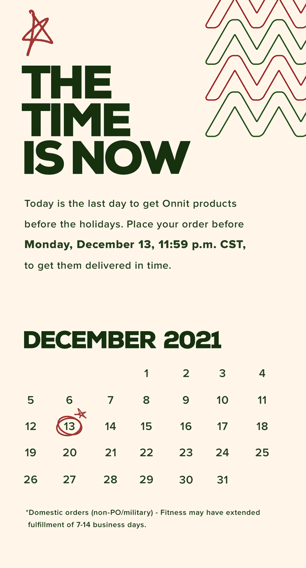
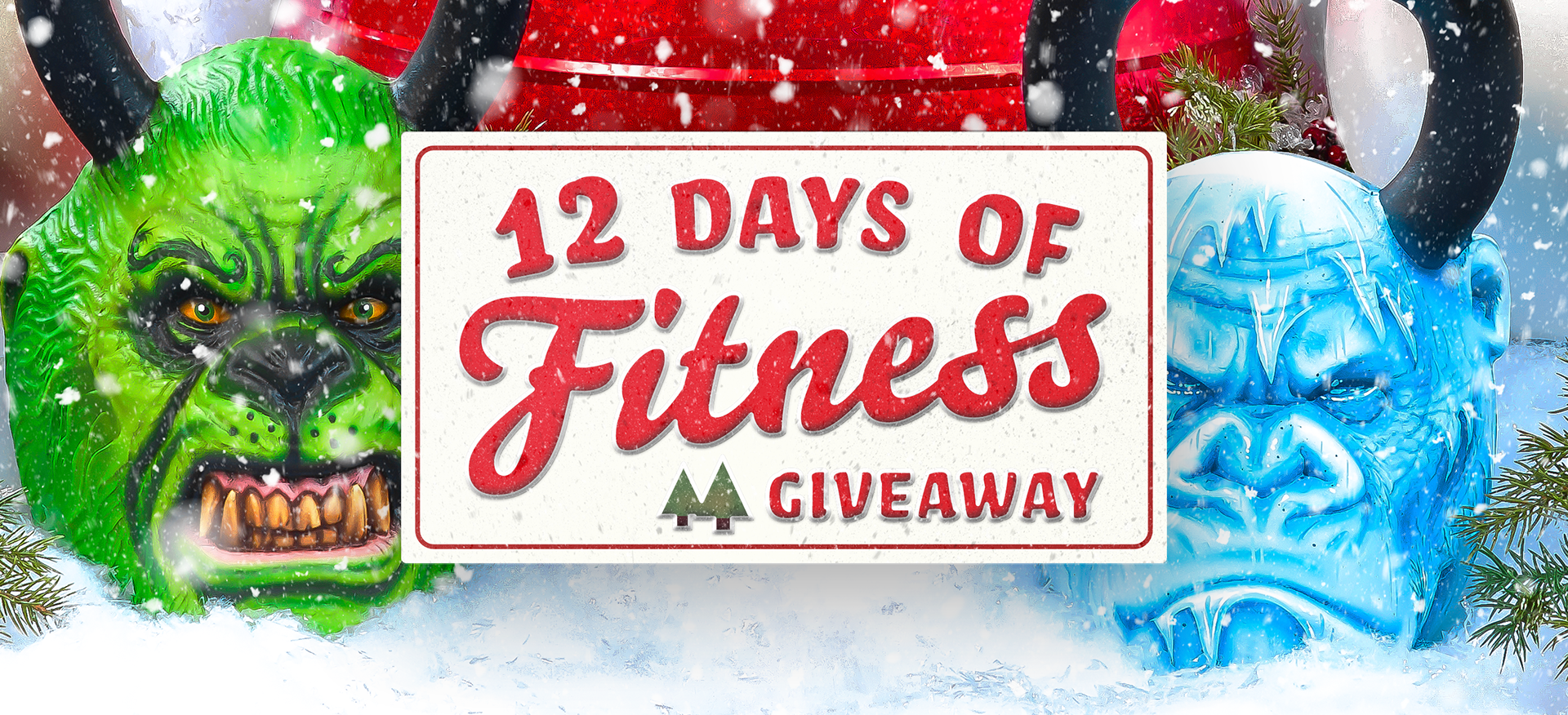
My header graphic for a holiday email, with some subtle-simple frame animation
Created this solid lock-up of words for a trade show wrap.
With a few angles of rotation, this little title treatment became a well placed logo
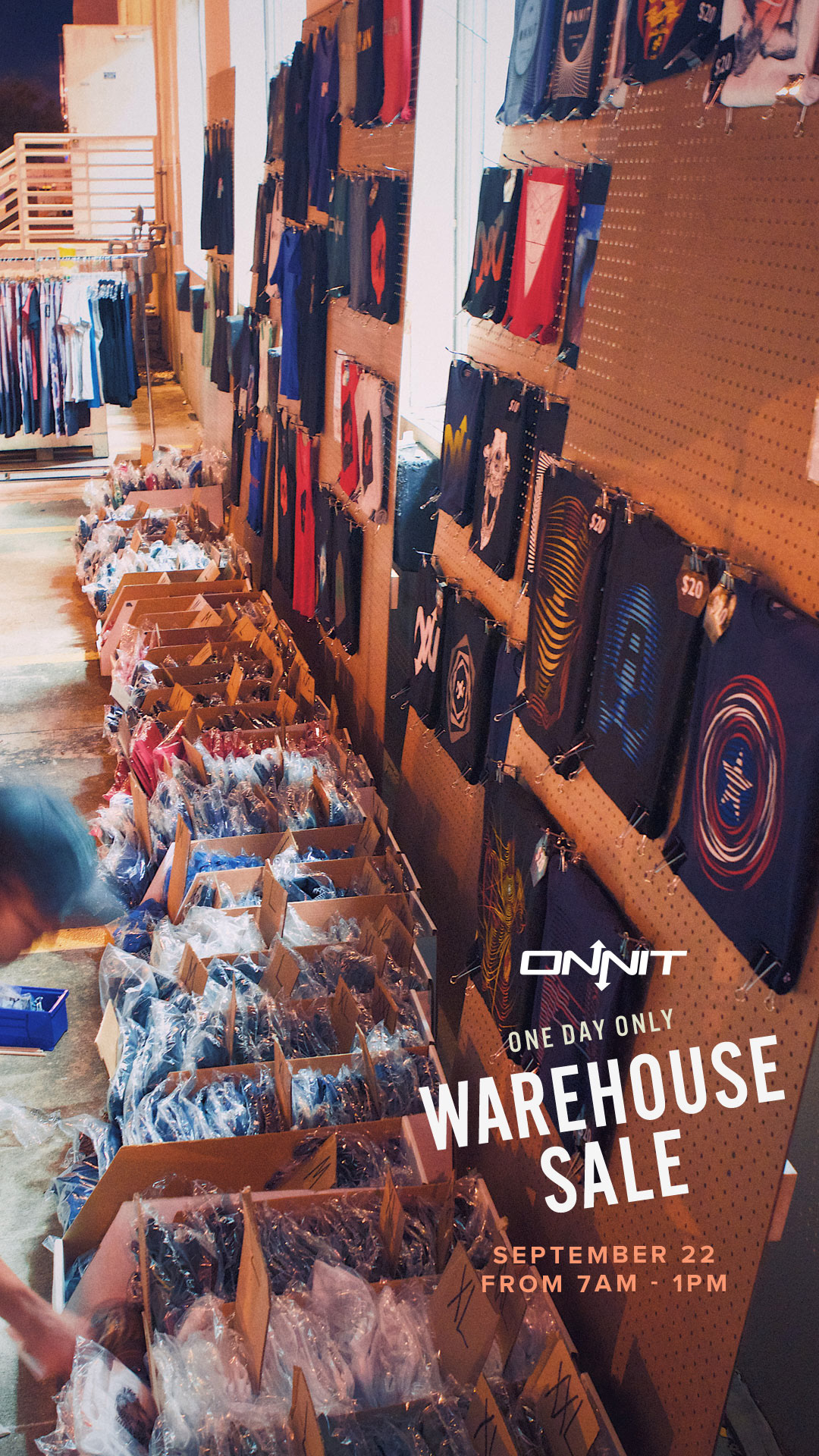
This modular layout system was able to morph into a flyers, emails, and social graphics.
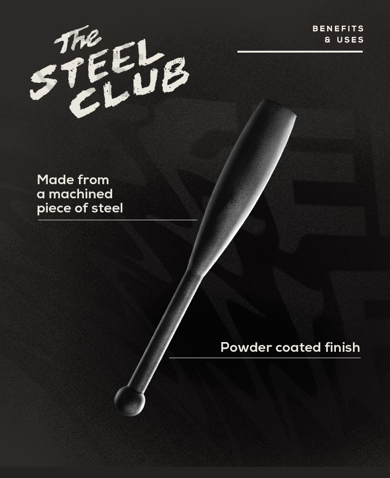
My own scribble-writing "The Steel Club" + my own post-production styling on the product + the warped text in the background + the clean line and sans serif = a think a beauty
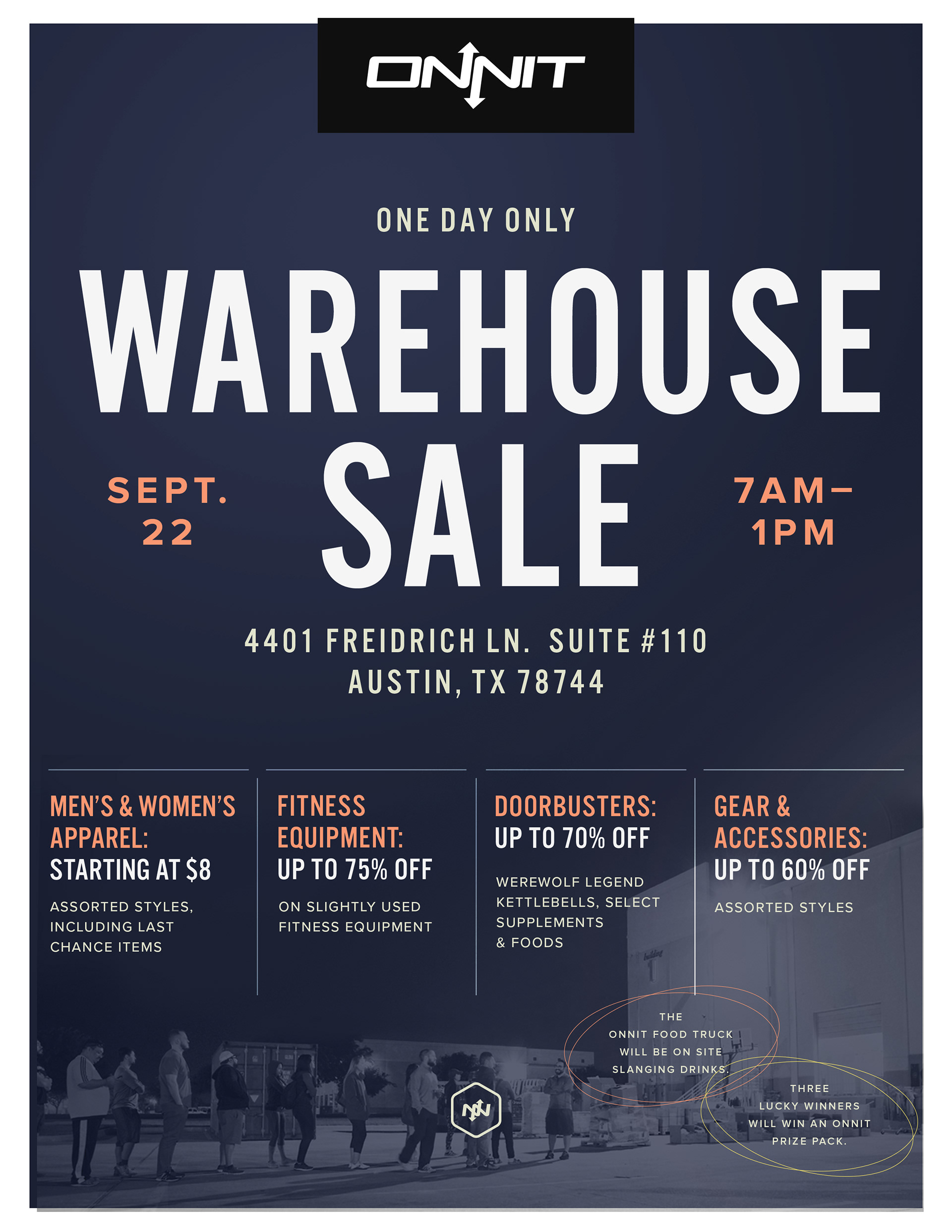
Showing off layout technique, using grids, color systems, and varying font sizes
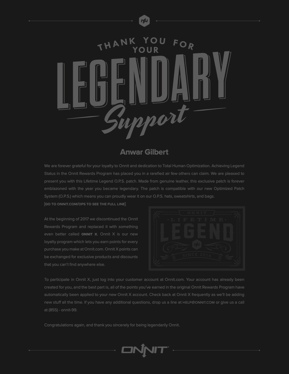
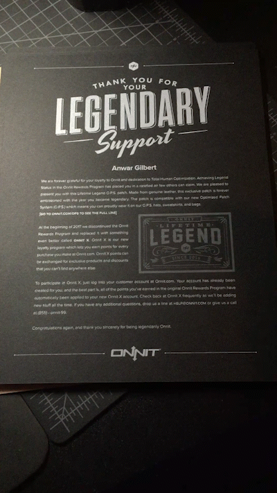
This letter was given to the very few legendary members. This was a token of appreciation.
From digital concept, then into physical reality. French Paper (Blacktop Construction + White Ink)
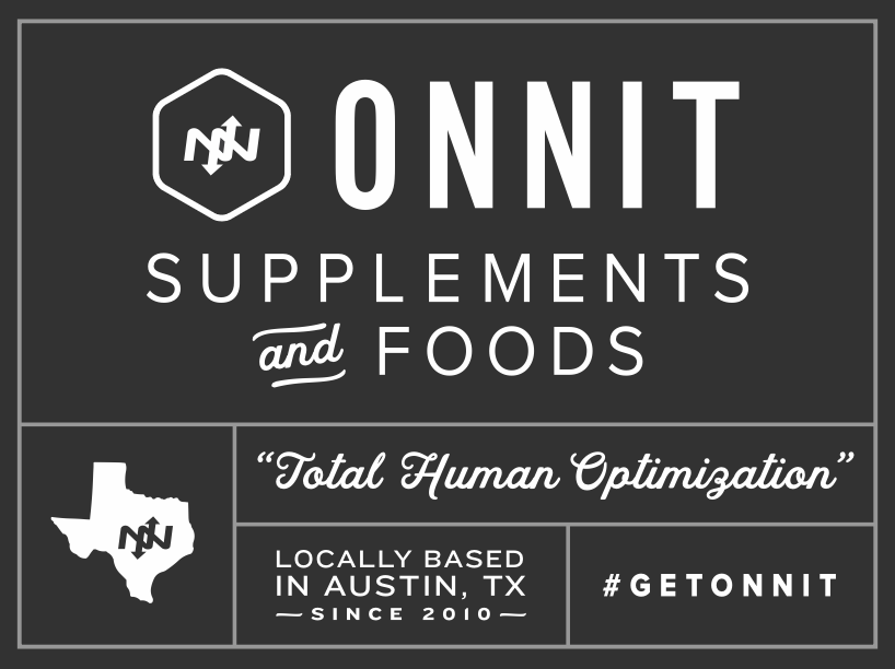
The assignment was the "introduce ourselves to new shoppers at retail stores like Whole Foods, Central Market, etc."
Signage was deliberately simple and easy to read.
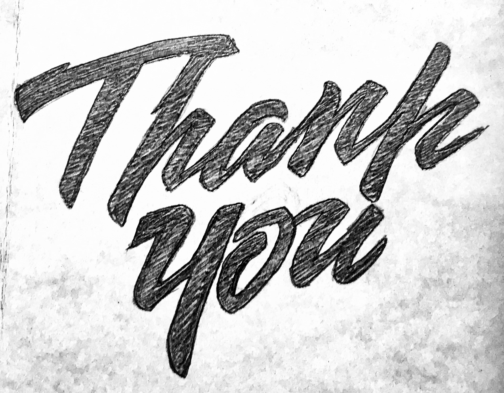
After a hand-drawn sketch, I then digitize it, and sometimes I'll animate it too
This is the original sketch.
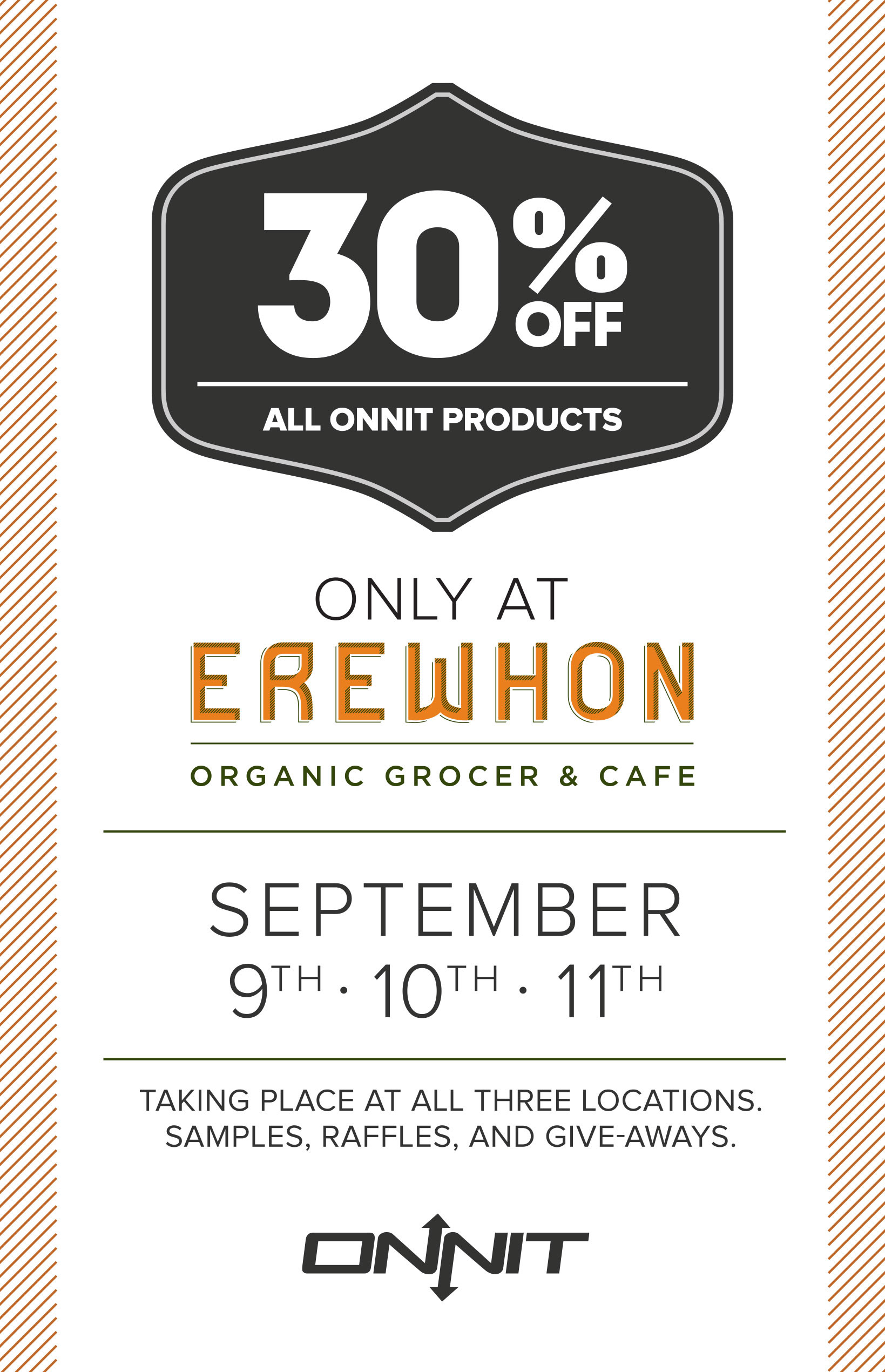
A flyer and email header for people at Erewhon
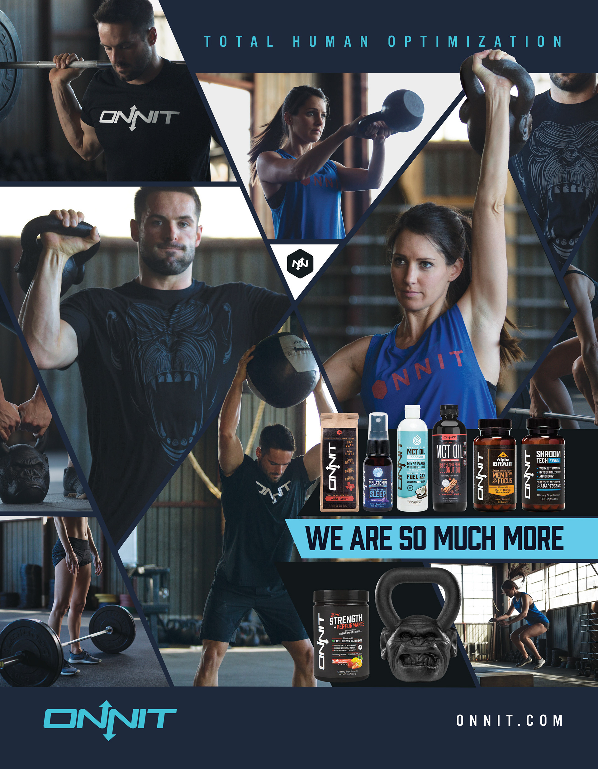
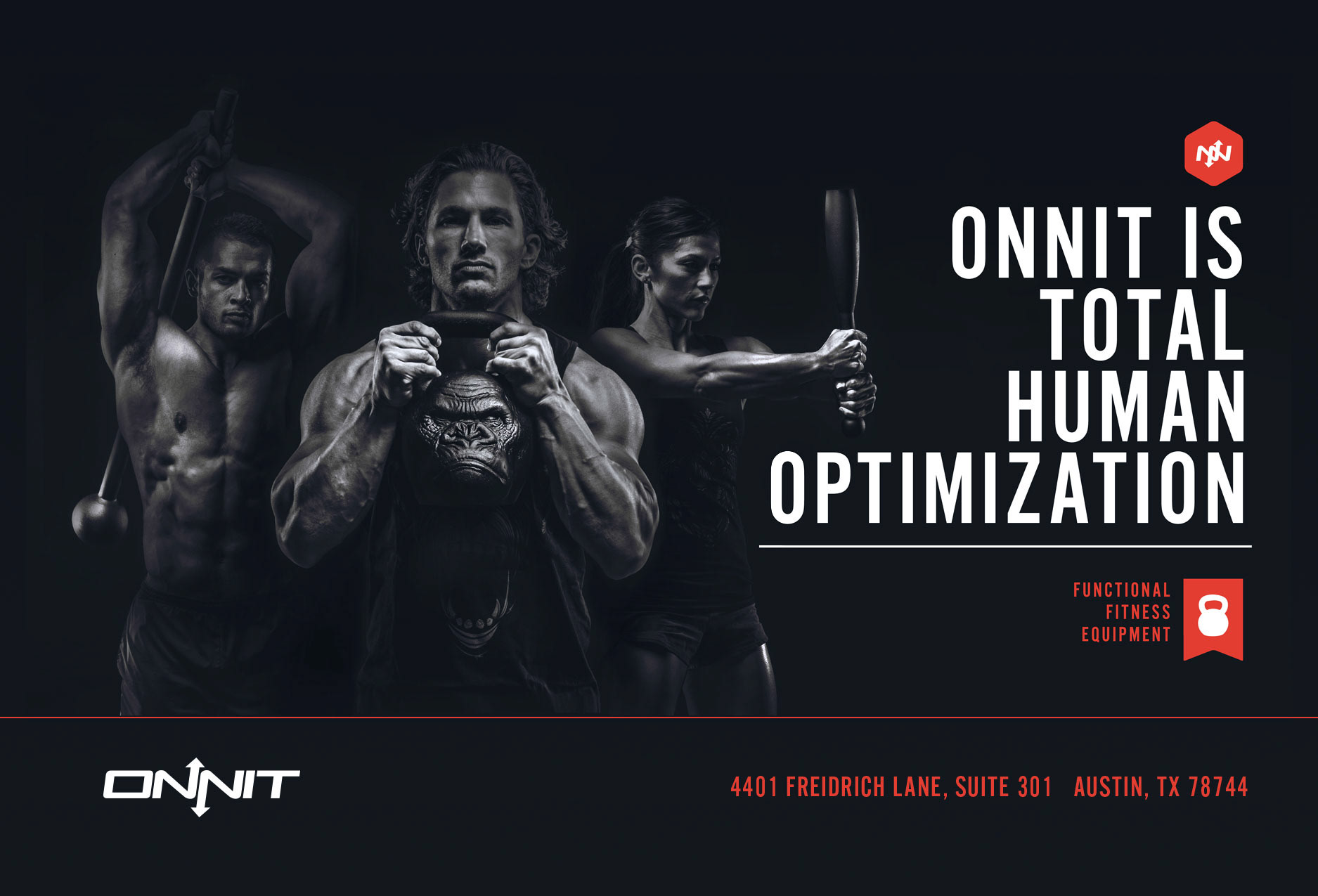
A magazine ad focused more on people rather than the logo, and the products.
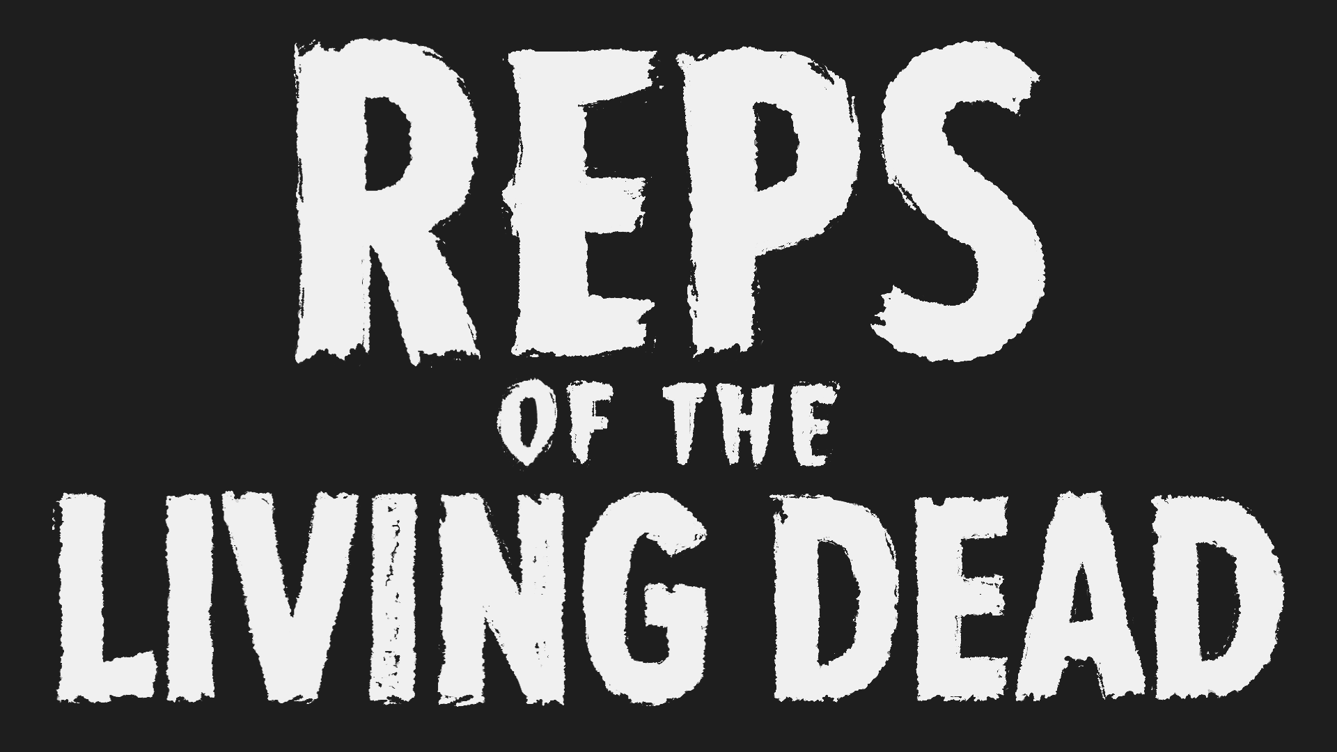
A solid and organized layout can be adaptable in all ratios.
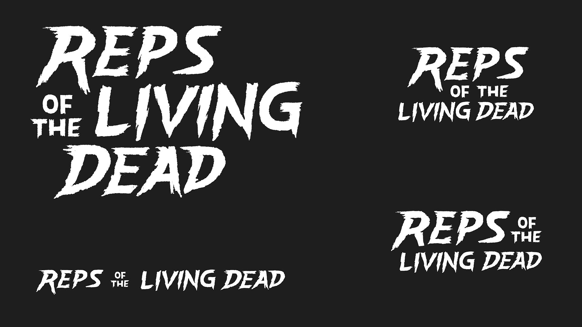
A solid and organized layout can be adaptable in all ratios.
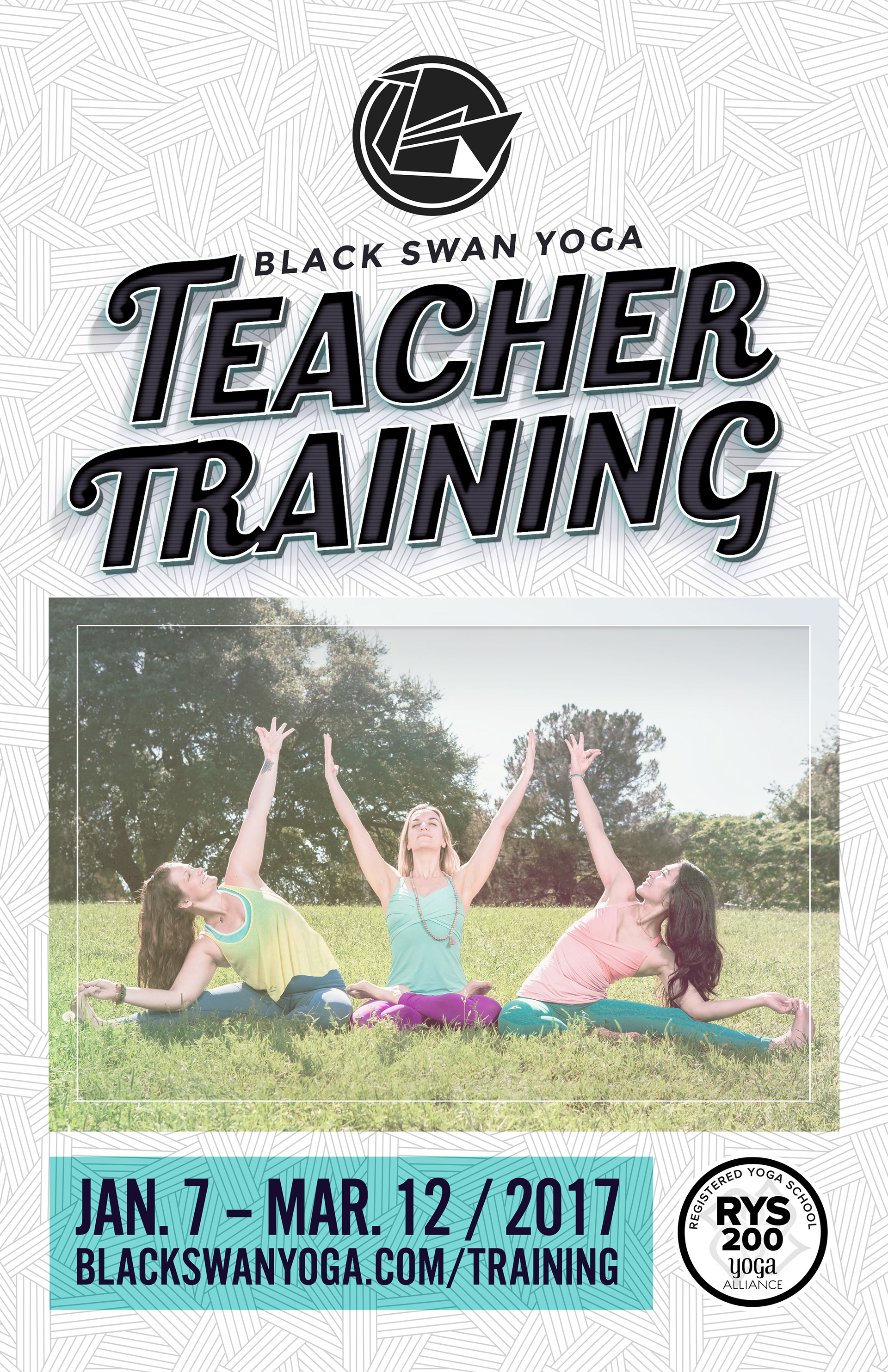
Posters for the studio wall. Style remains consistent with the brand direction.
Posters for the studio wall. Style remains consistent with the brand direction.
This started as a trade show wrap that would extend through smaller print forms
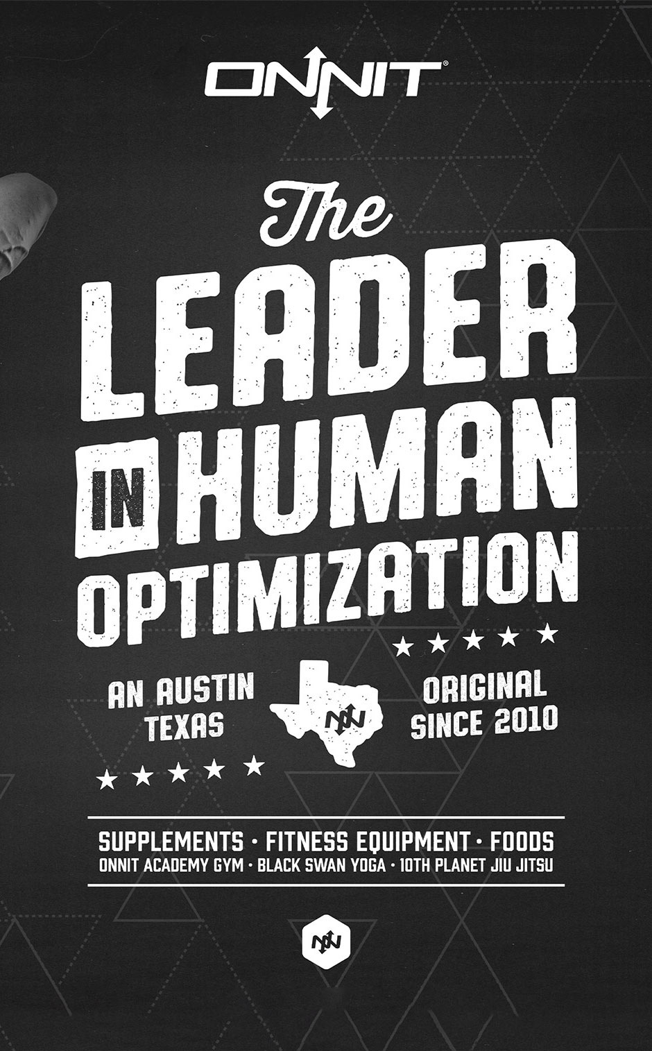
Another holiday vibe. Font choices were clean and positioned in the center and presented like a metal pressed sign.
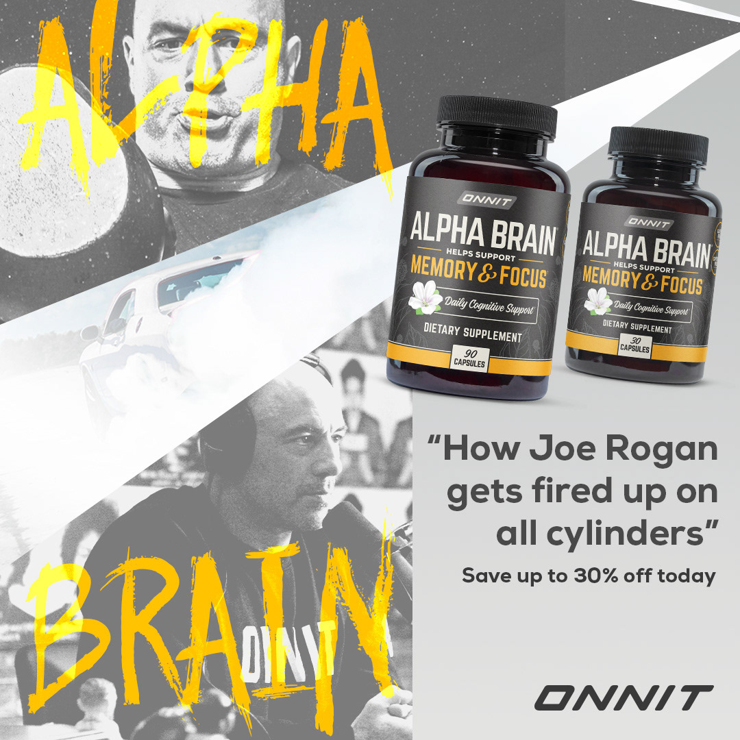
One way of producing a 1:1 graphic is to split the area in quadrants. Run the primary headline in the center, then flank the remaining copy above and below it using a smaller size. And don't forget your background texture.
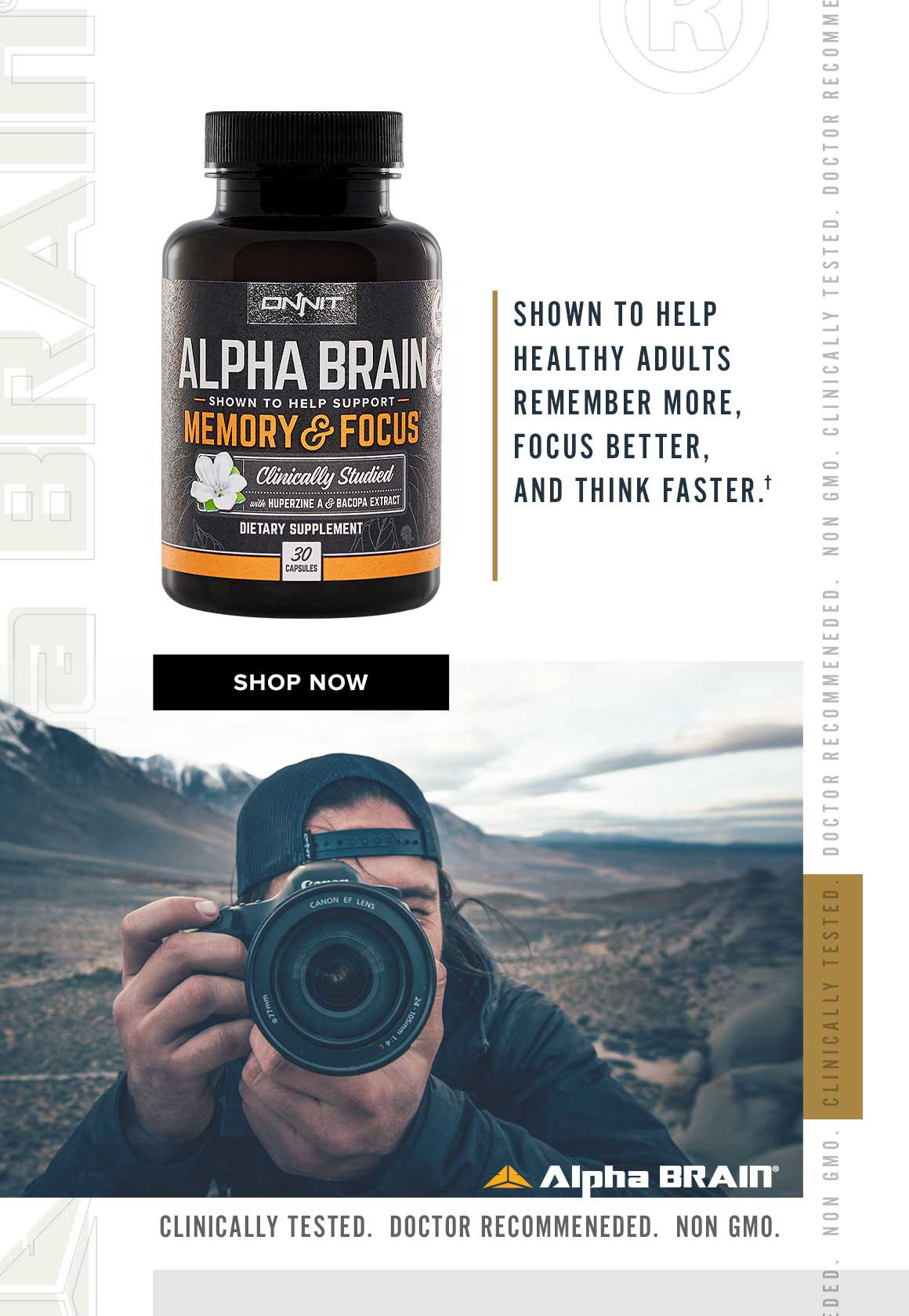
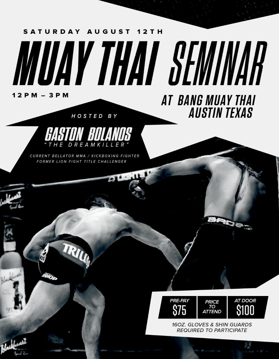
Sometimes I let the photograph dictate the flow of the layout. I split the layout in half (top and bottom). With the photograph applied to the bottom, I follow the action and converging lines to aim at focus points.
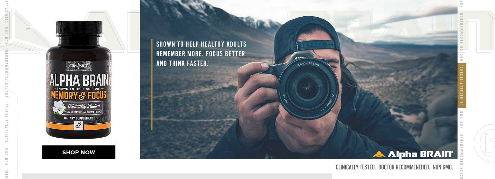
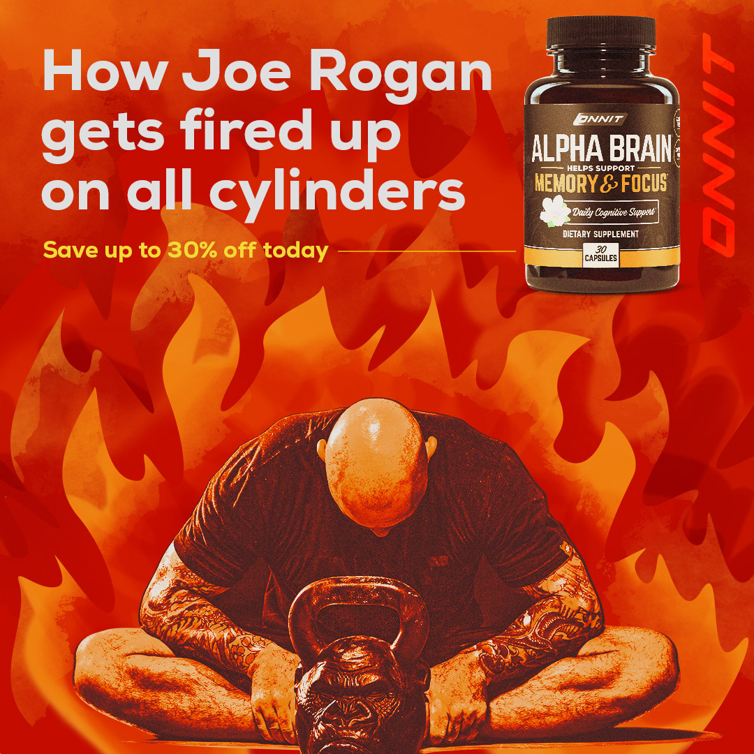
No one thought we could reuse the same photograph over and over ... spoiler alert, it happened. This required learning new techniques from TextureLabs. The end result was FIRE!!!
I direct your eyes to see what I want you to see, and then maybe afterwards you'll see the burnout.
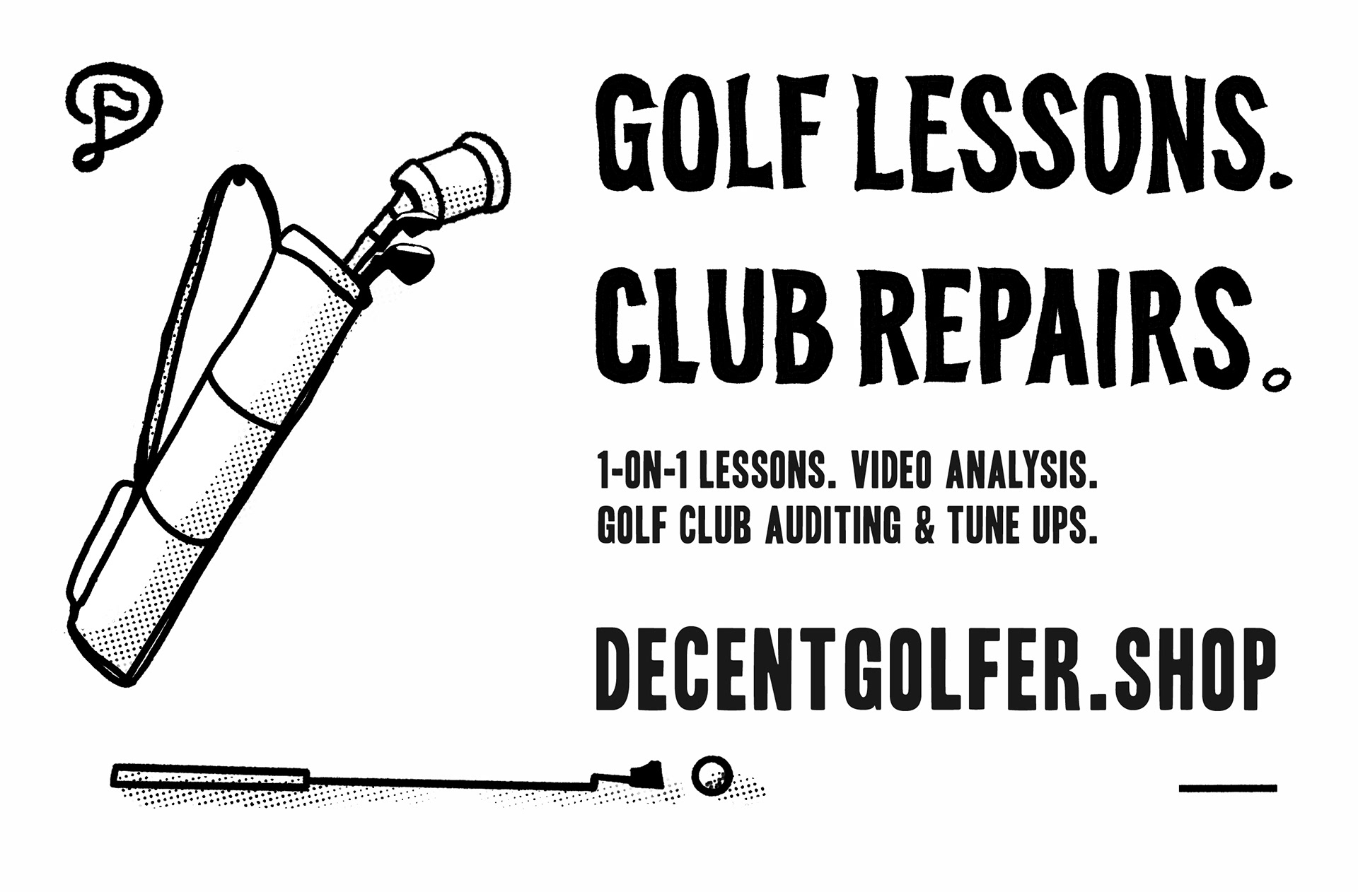
Adding this one from my Decent Golfer brand because of the hand-drawn title working together nicely with "Headline One Font"