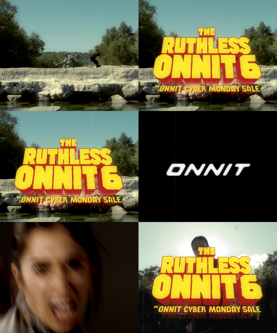

Reps of the Living Dead & The Ruthless Onnit 6
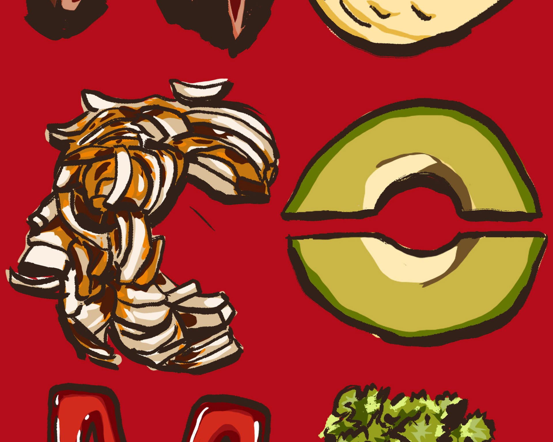
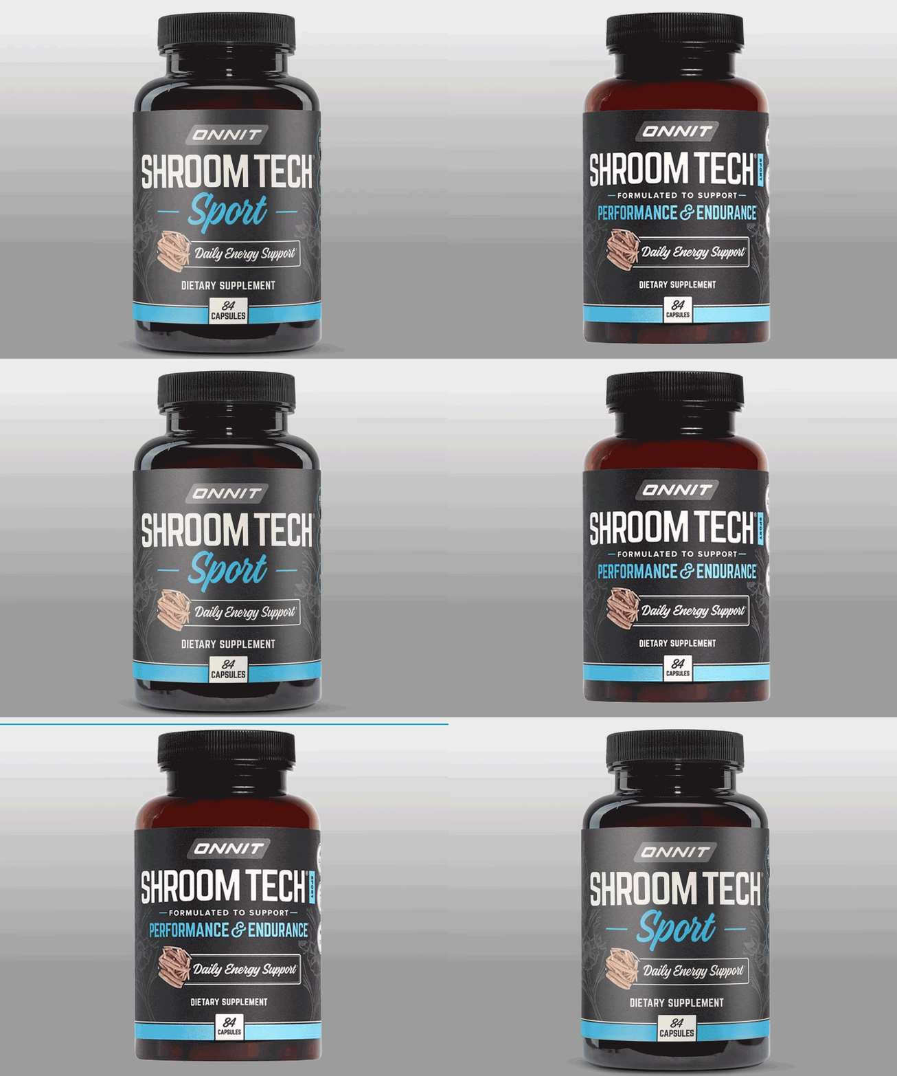
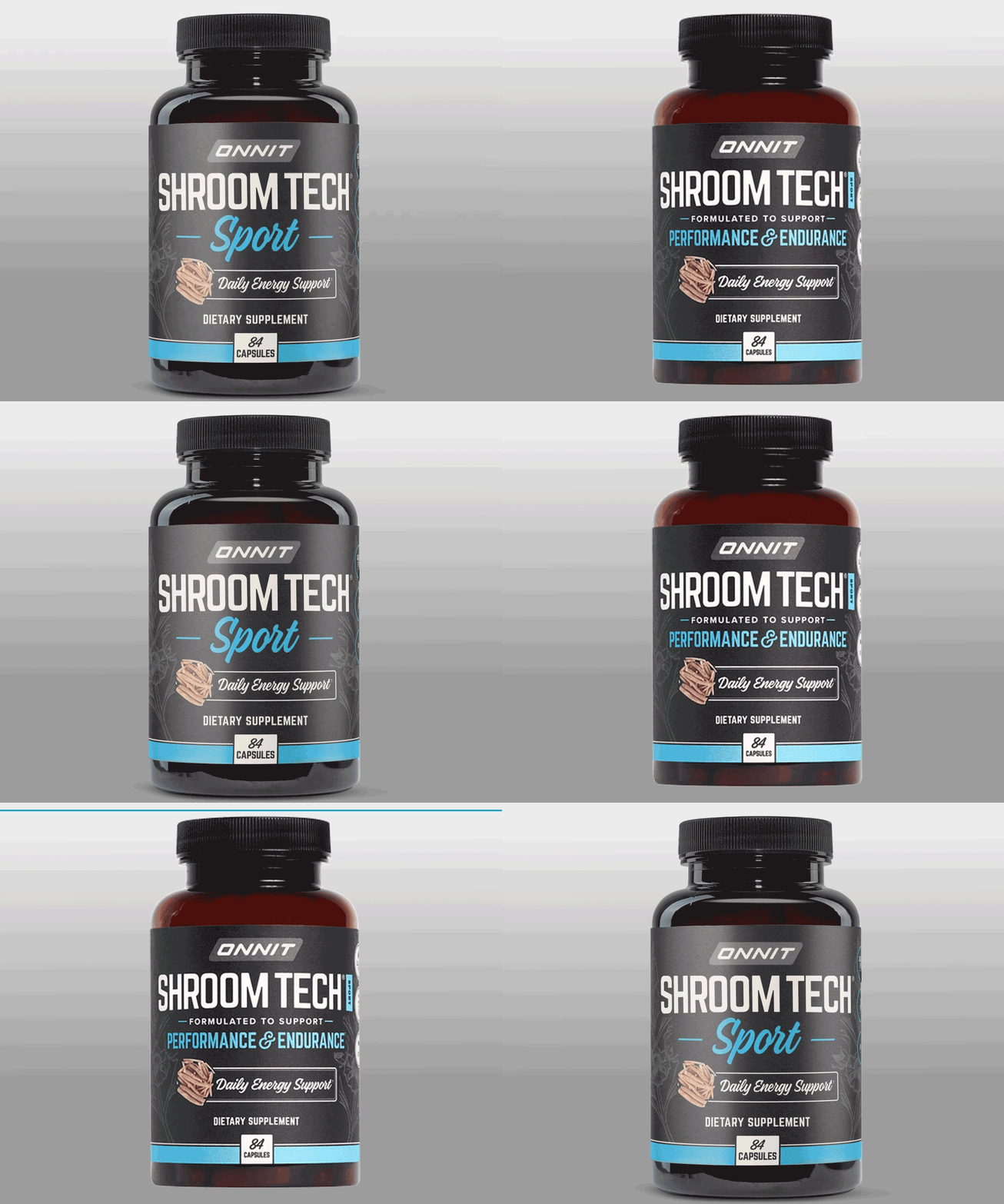
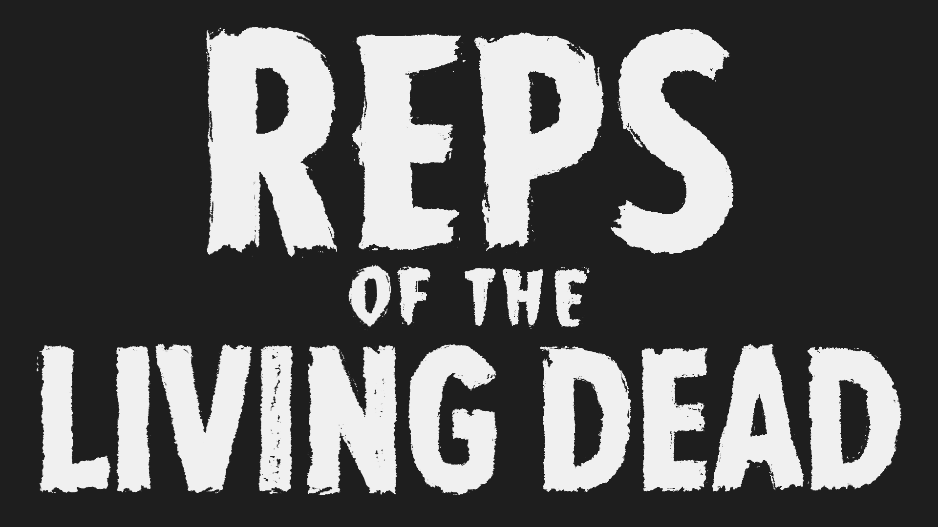
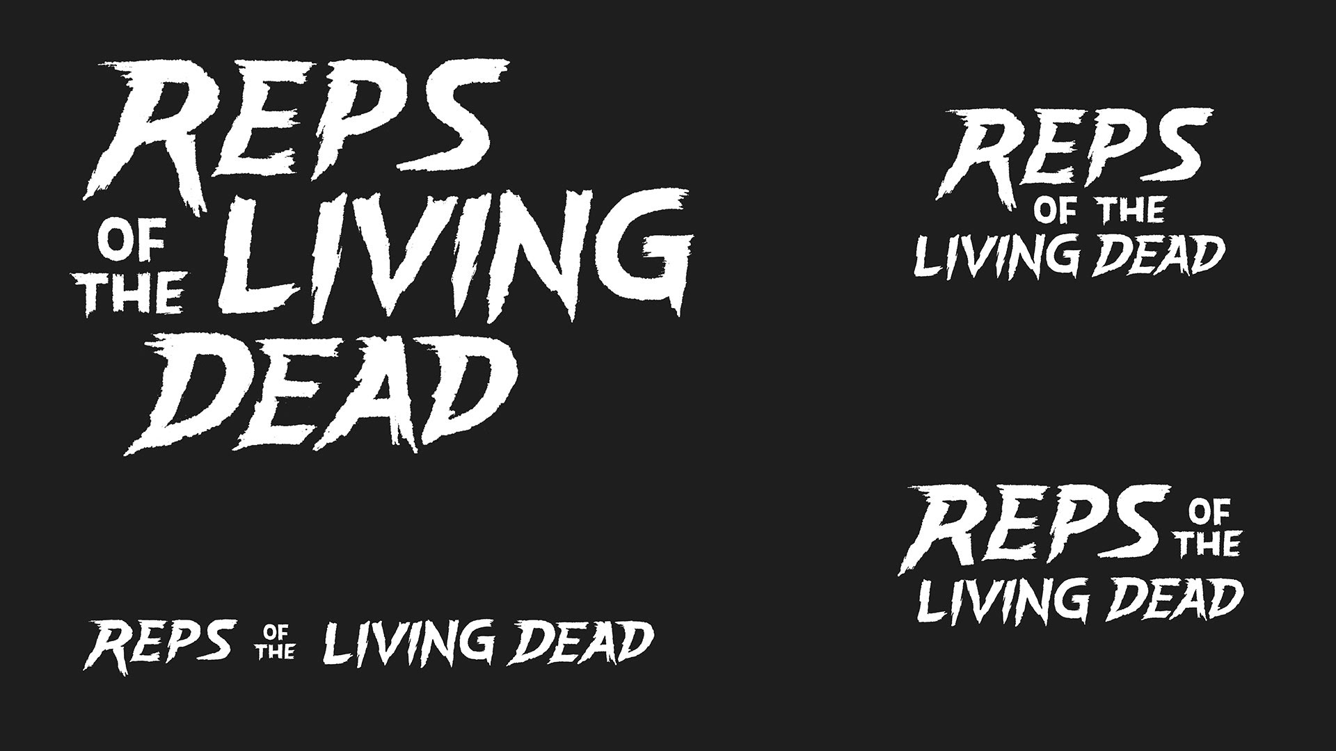
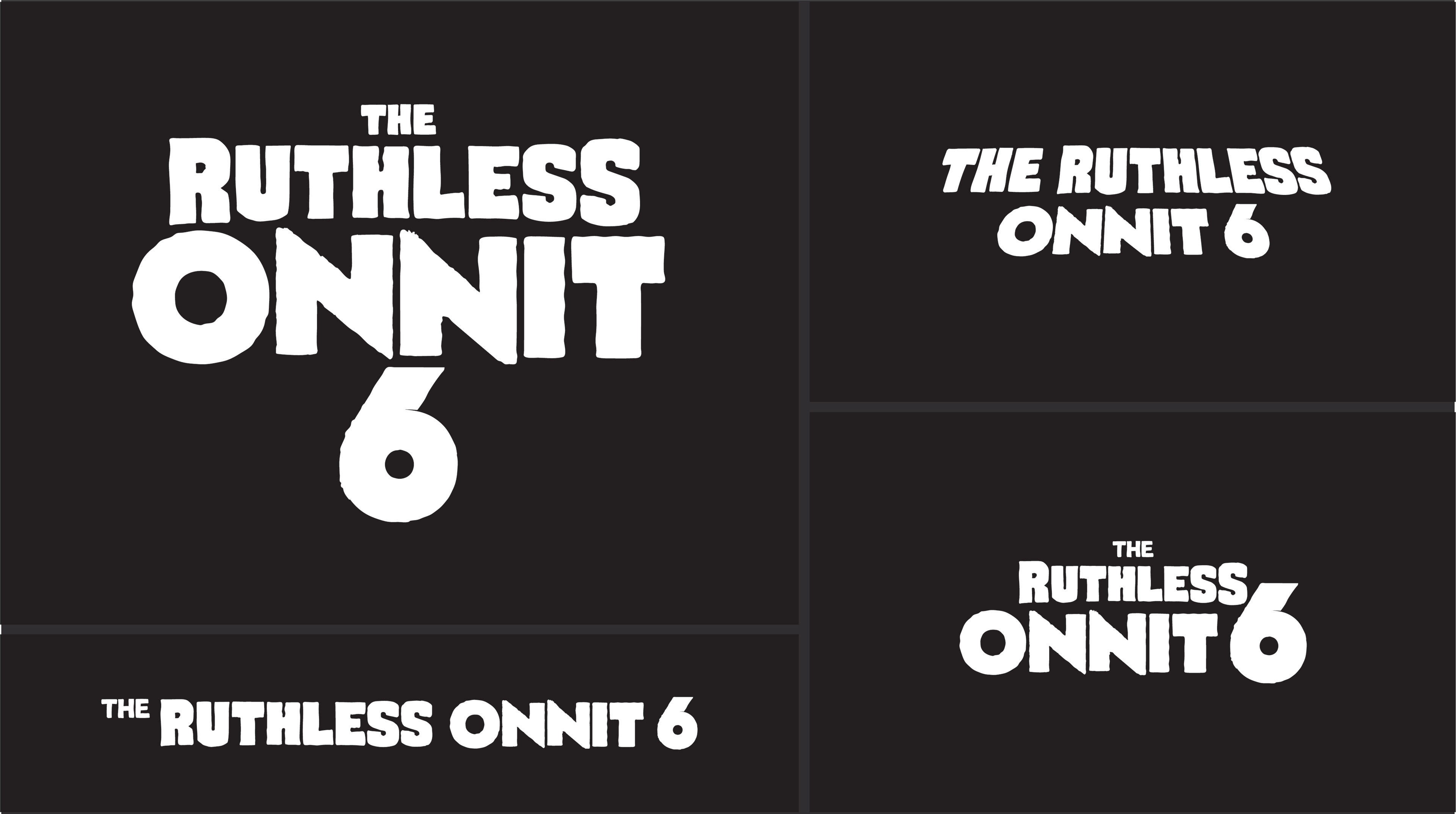
These movie titles were inspired by classic cinema genres like film-noir, horror & kung fu. I sketched them using photoshop brushes and a wacom tablet. The two examples shown below did not make the final cut.
These movie titles were inspired by classic cinema genres like film-noir, horror & kung fu. I sketched them using photoshop brushes and a wacom tablet. The two examples shown below did not make the final cut.
The approved movie titles appear in my Black Friday 2019 Campaign.
Handlettering for Decent Golfer
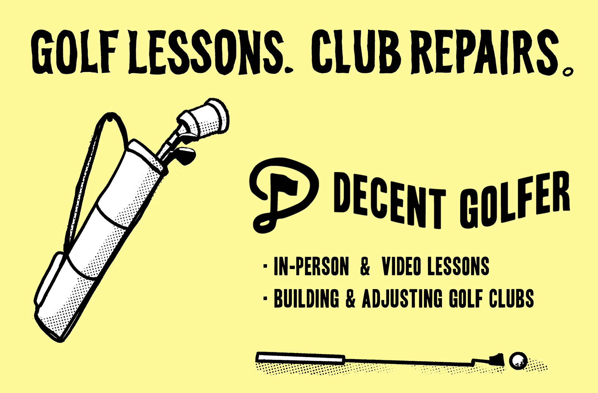
Going from a sketch into a final is sometimes faster when I'm handlettering. This was designed as a quick flyer to advertise a golf business.
Going from a sketch into a final is sometimes faster when I'm handlettering. This was designed as a quick flyer to advertise a golf business.
More can be see at decentgolfer.shop
Purposeful Digital Designs For Onnit
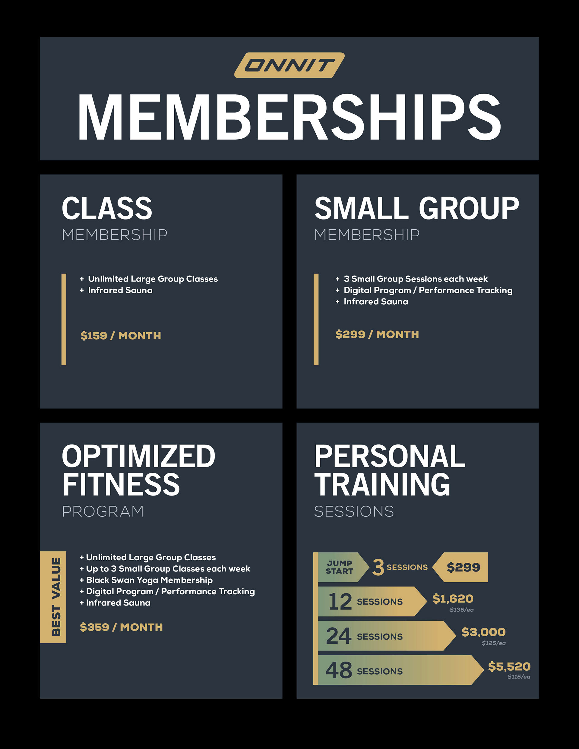
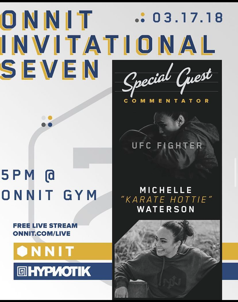
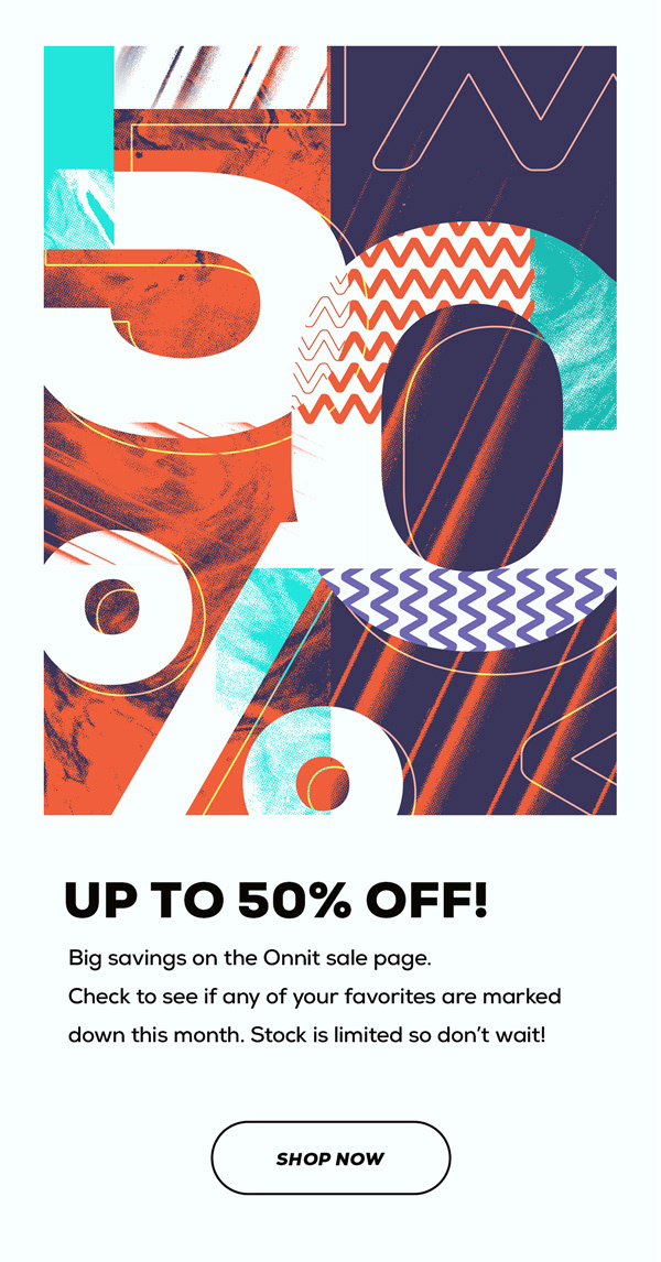
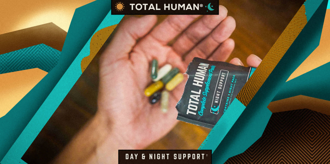
Every moment, every pixel was considered. I move through each with Gesalt Design Principles, trying to push the envelope of brand identity without compromising the customer experience. These graphics are generally designed very rapidly—a mere day or two at most—then broadcasted onto channels for about 48 hours and then pushed down feed with the next graphic.
Every moment, every pixel was considered. I move through each with Gesalt Design Principles, trying to push the envelope of brand identity without compromising the customer experience. These graphics are generally designed very rapidly—a mere day or two at most—then broadcasted onto channels for about 48 hours and then pushed down feed with the next graphic.
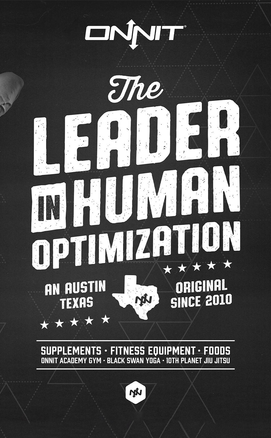
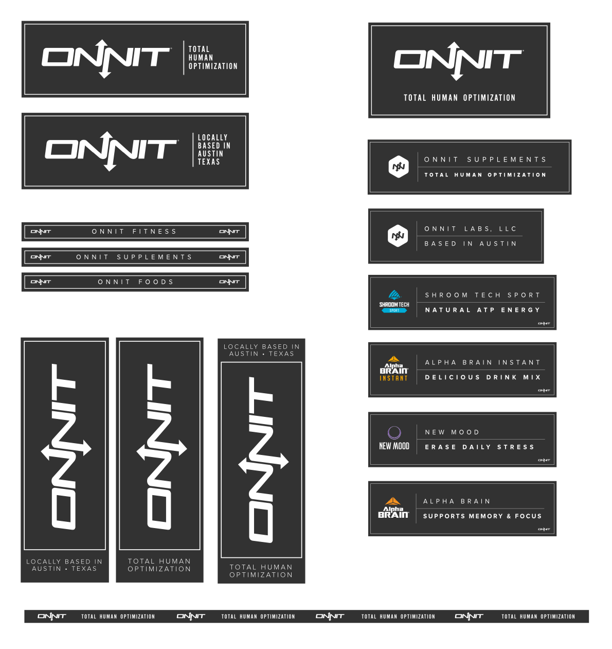
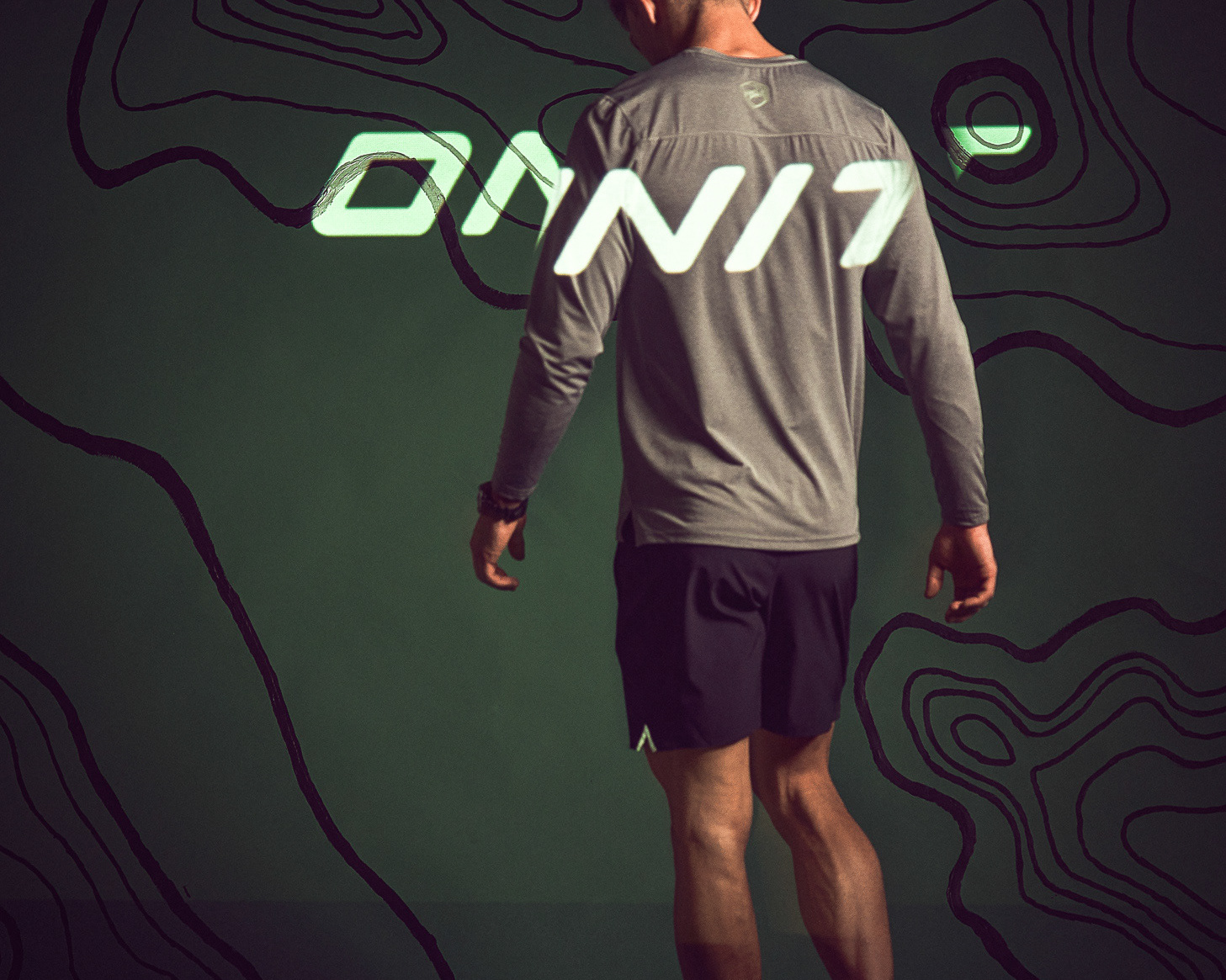
Created this solid lock-up of words for a trade show wrap.
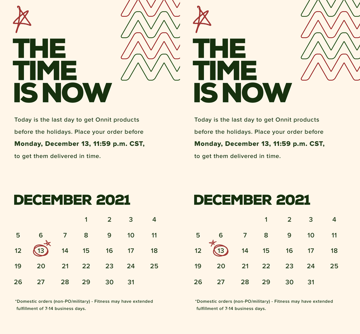
My header graphic for a holiday email, with some subtle-simple frame animation
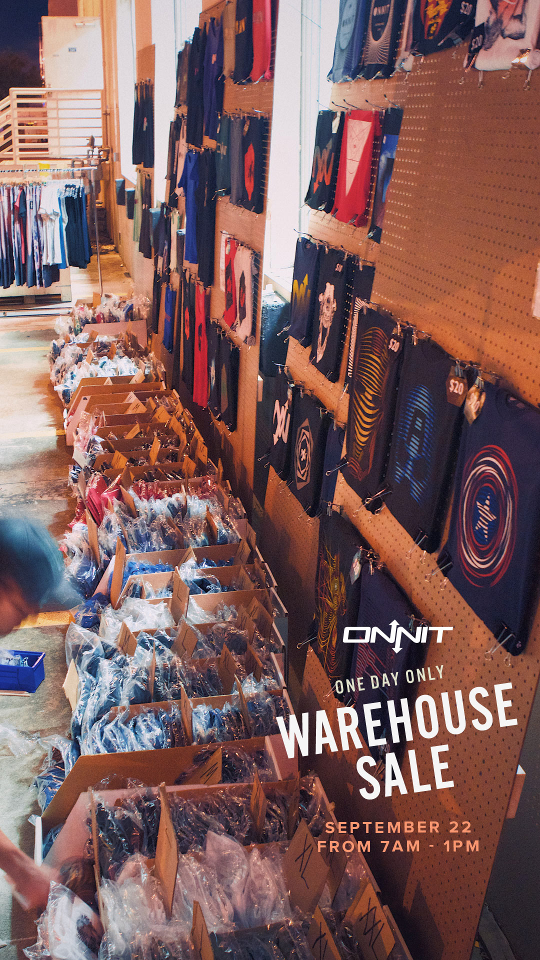
With a few angles of rotation, this little title treatment became a well placed logo
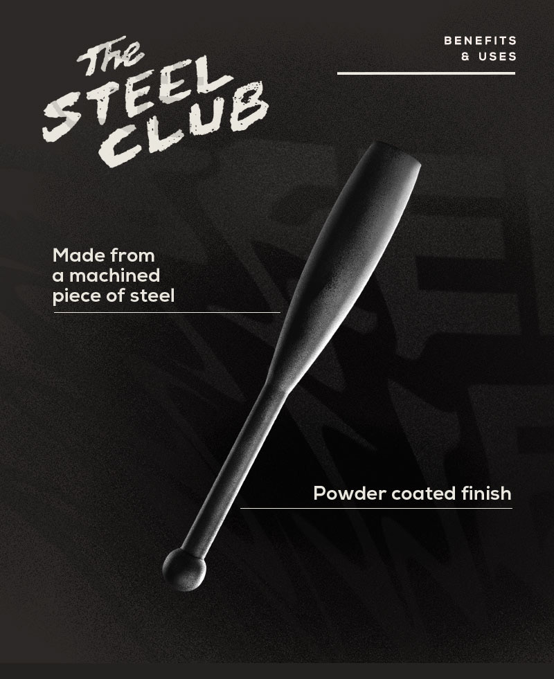
My own scribble-writing "The Steel Club" + my own post-production styling on the product + the warped text in the background + the clean line and sans serif = a think a beauty

After a hand-drawn sketch, I then digitize it, and sometimes I'll animate it too
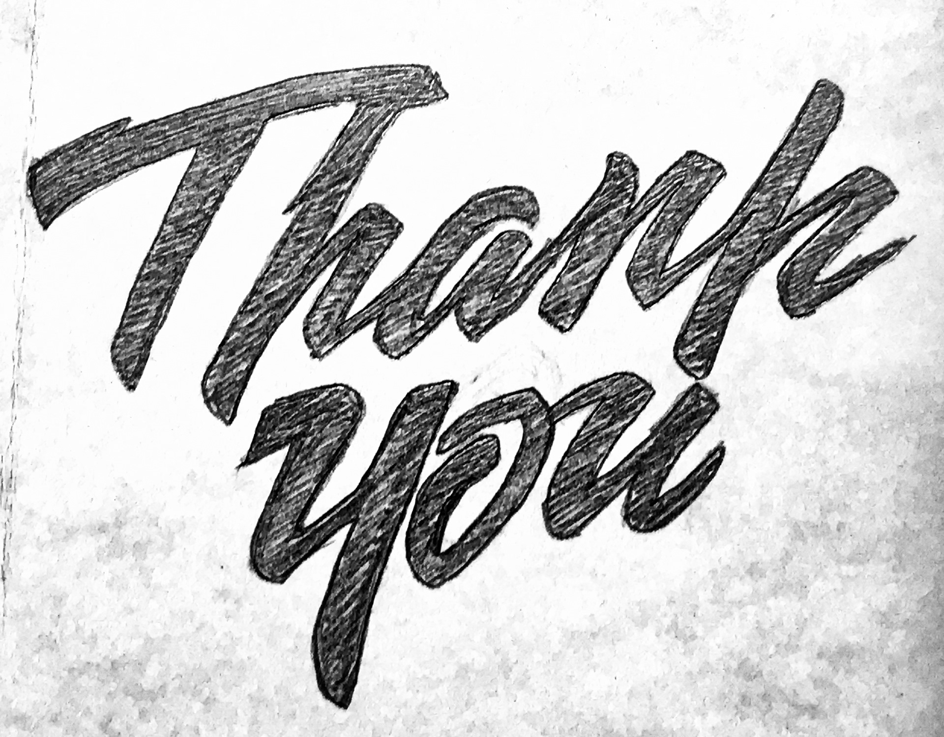
This is the original sketch.

A solid and organized layout can be adaptable in all ratios.

A solid and organized layout can be adaptable in all ratios.

Another holiday vibe. Font choices were clean and positioned in the center and presented like a metal pressed sign.

One way of producing a 1:1 graphic is to split the area in quadrants. Run the primary headline in the center, then flank the remaining copy above and below it using a smaller size. And don't forget your background texture.
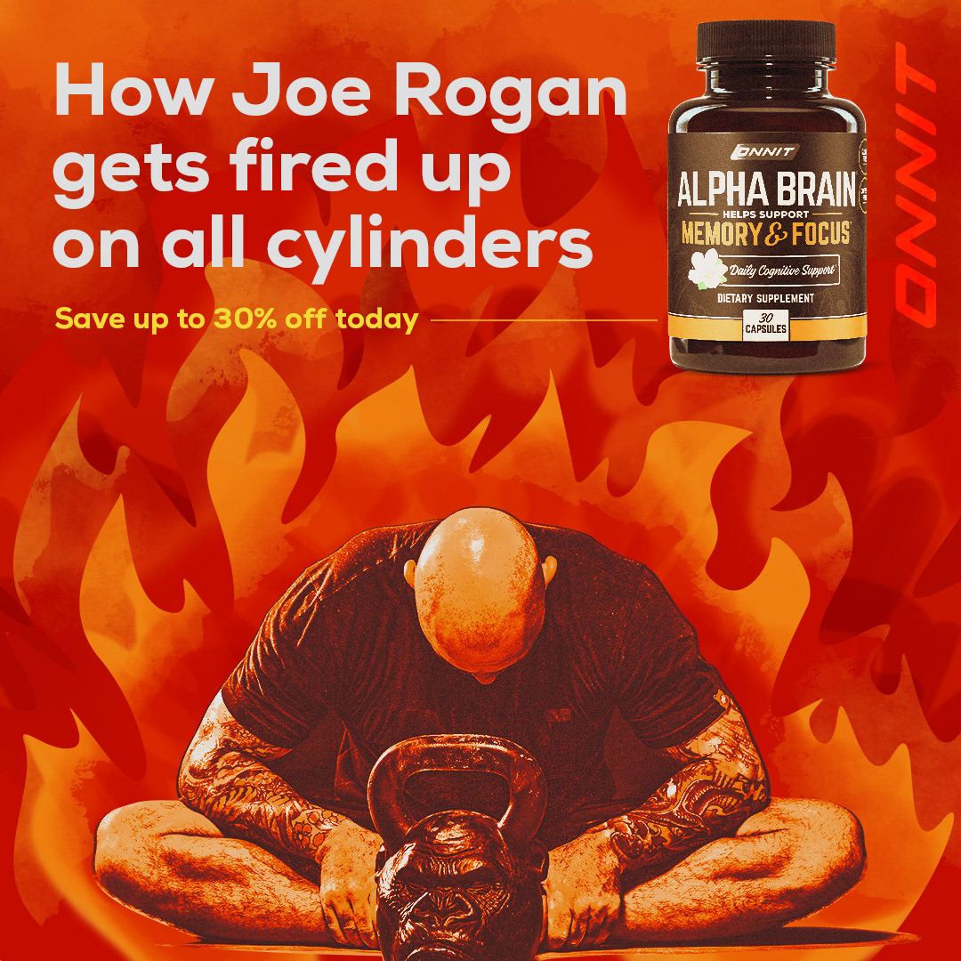
No one thought we could reuse the same photograph over and over ... spoiler alert, it happened. This required learning new techniques from TextureLabs. The end result was FIRE!!!
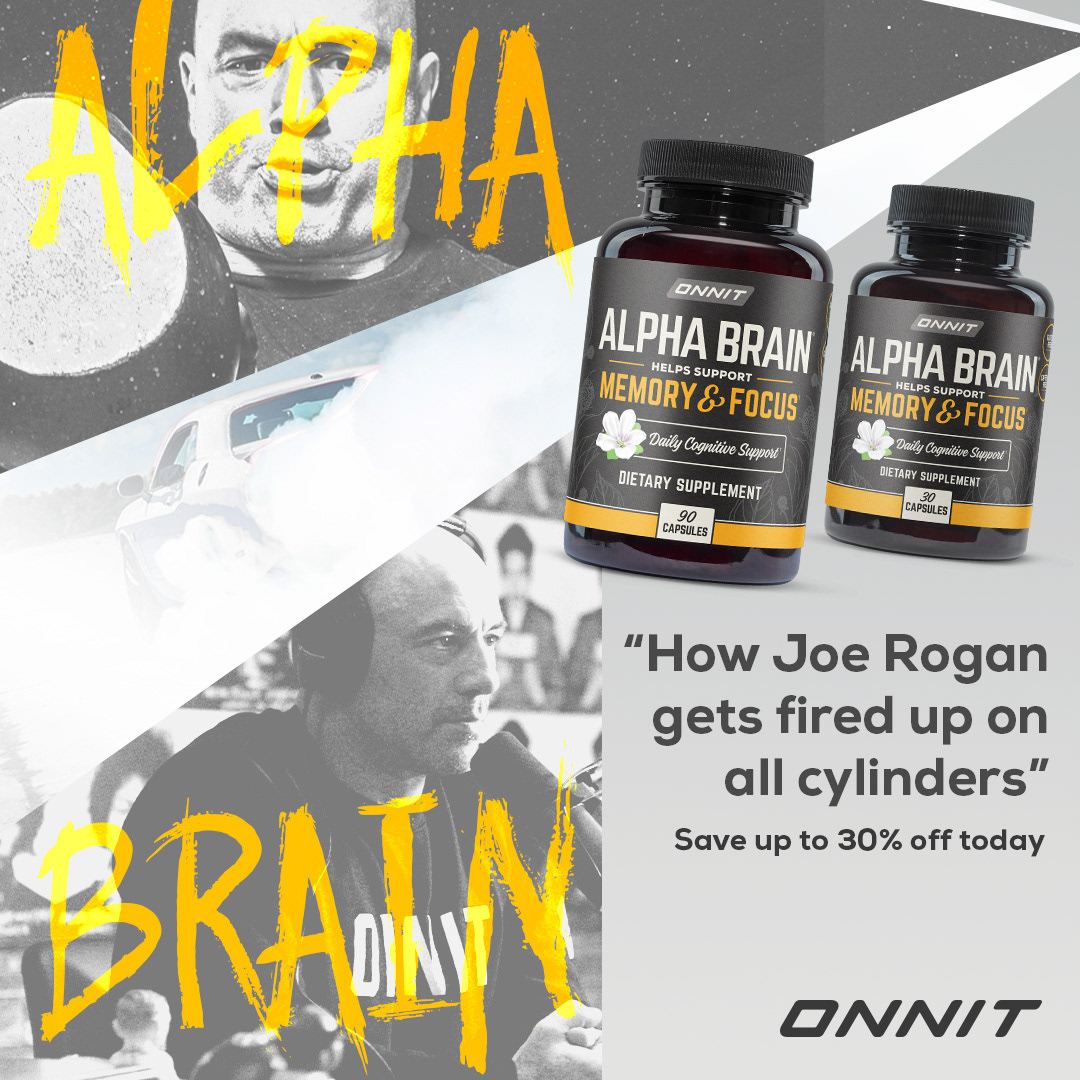
I direct your eyes to see what I want you to see, and then maybe afterwards you'll see the burnout.
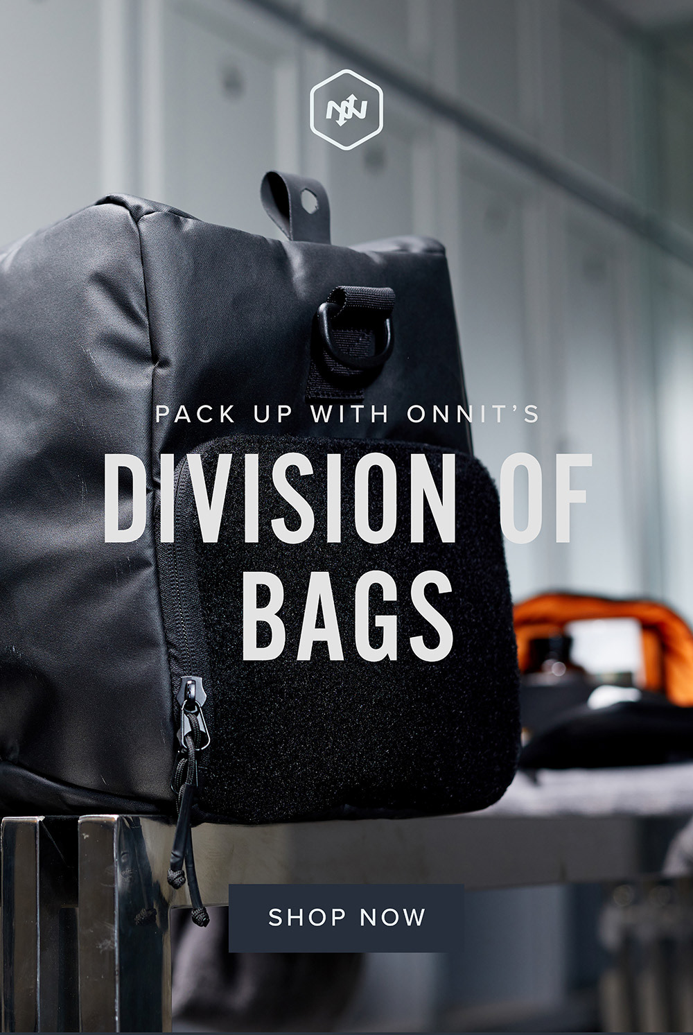
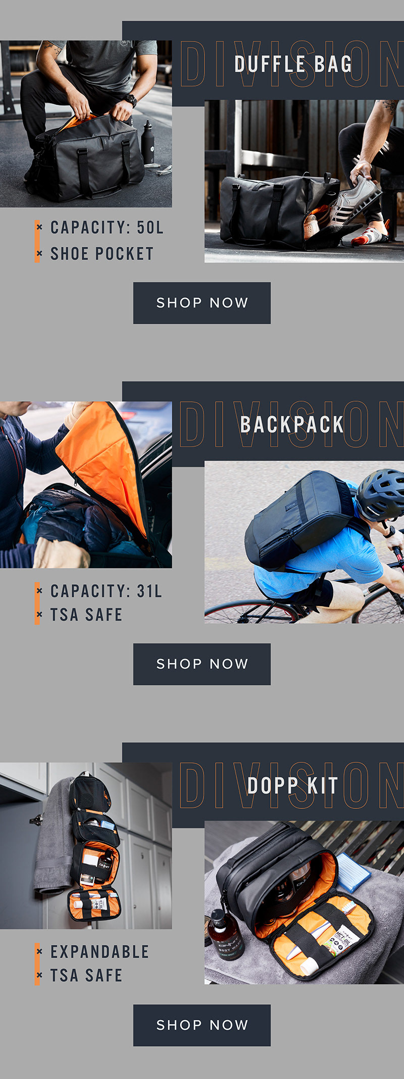
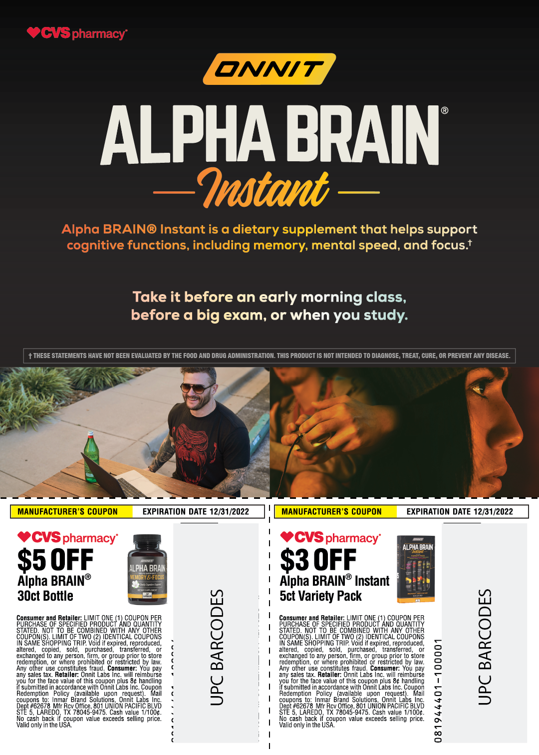
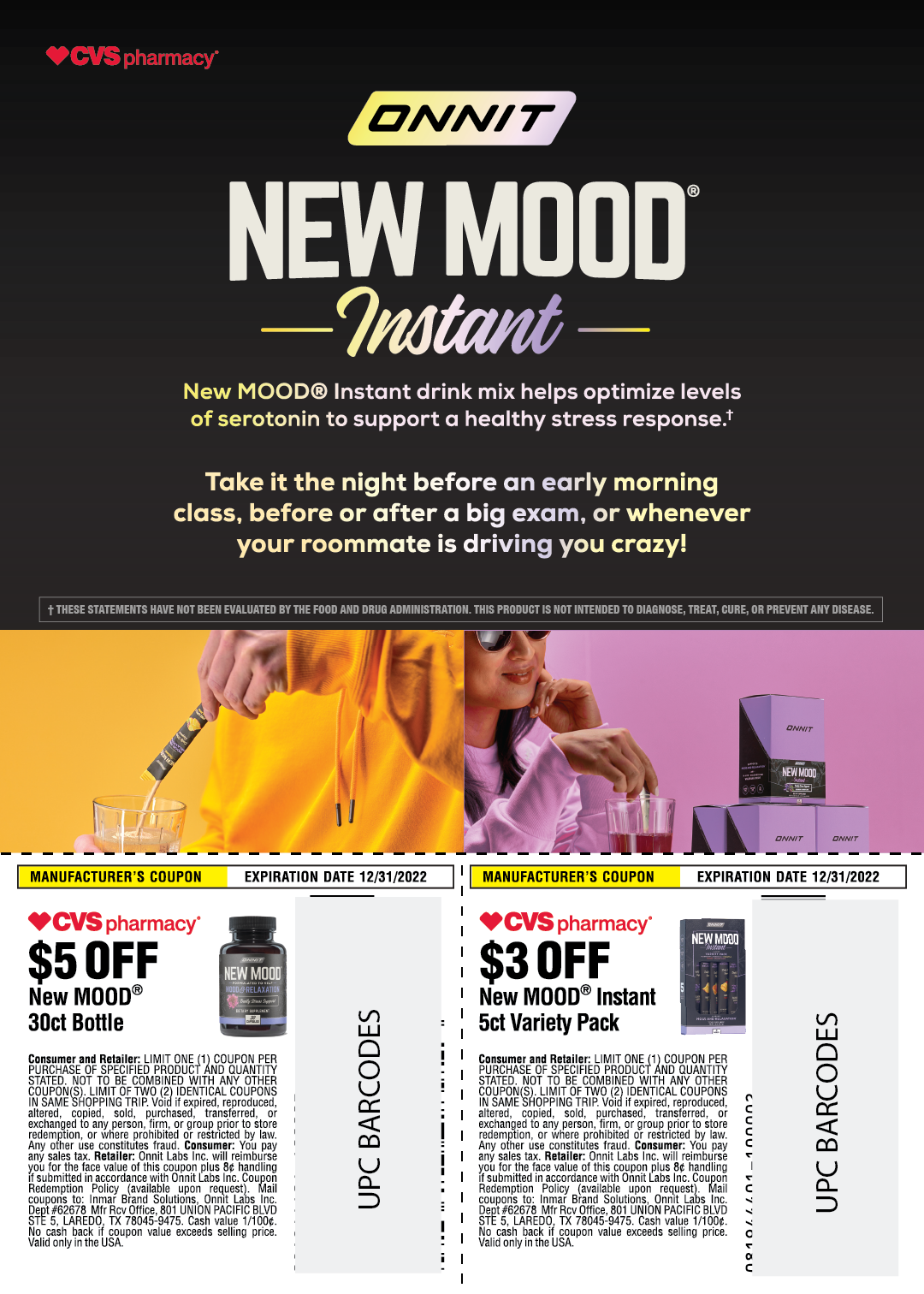
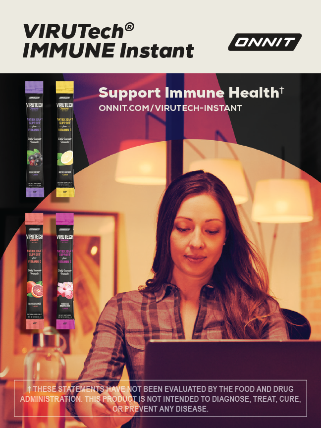
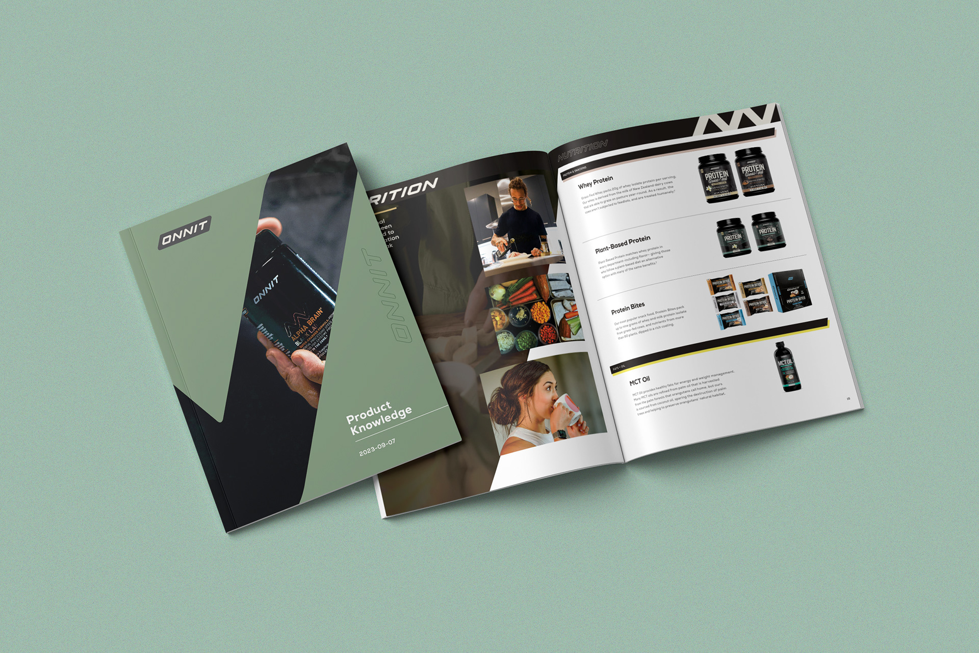
Purposeful Print Designs For Onnit
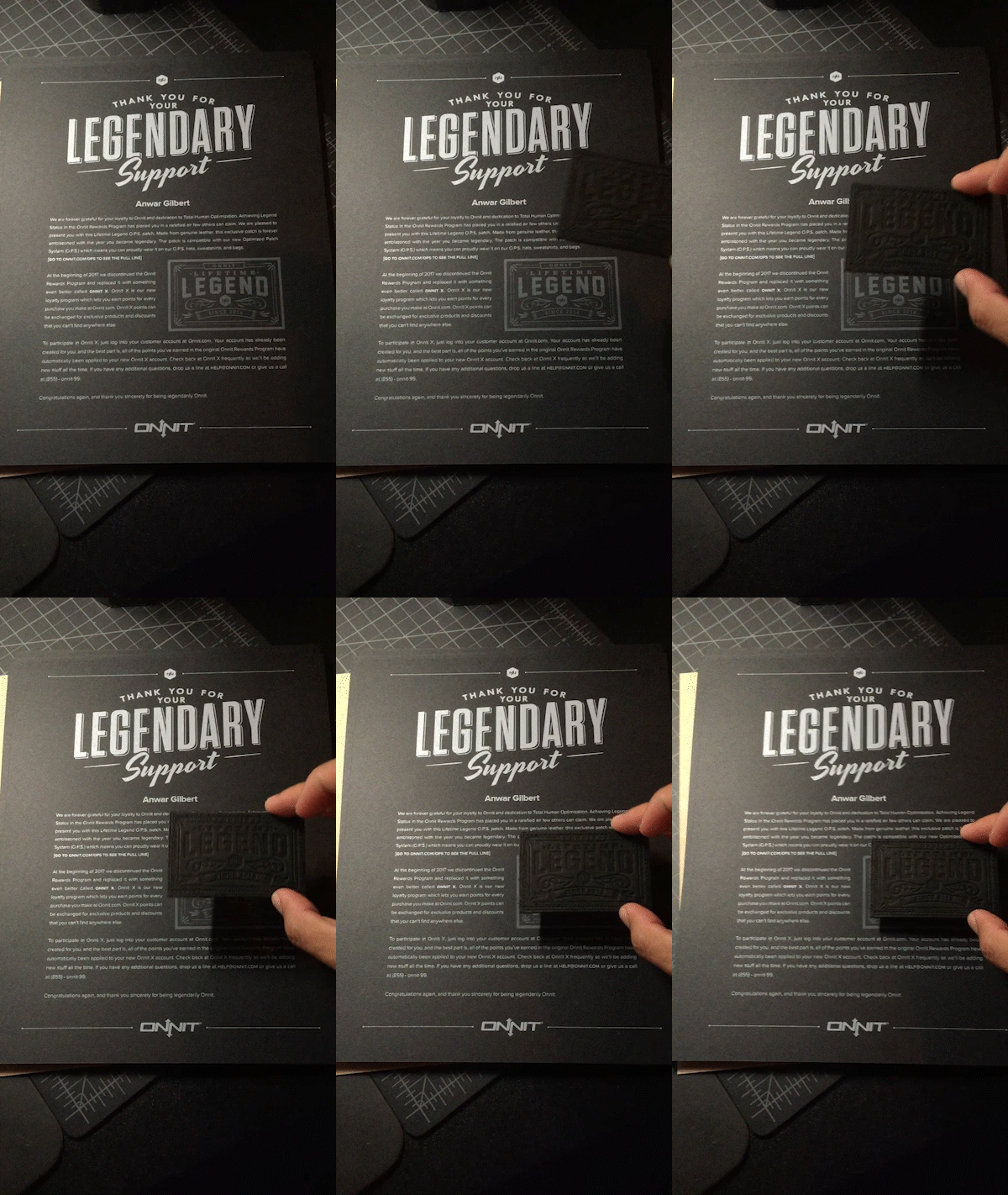
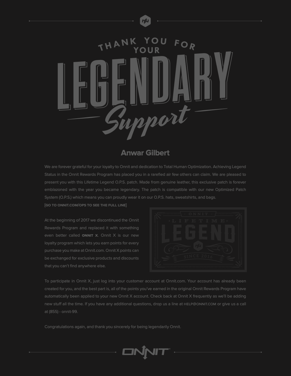
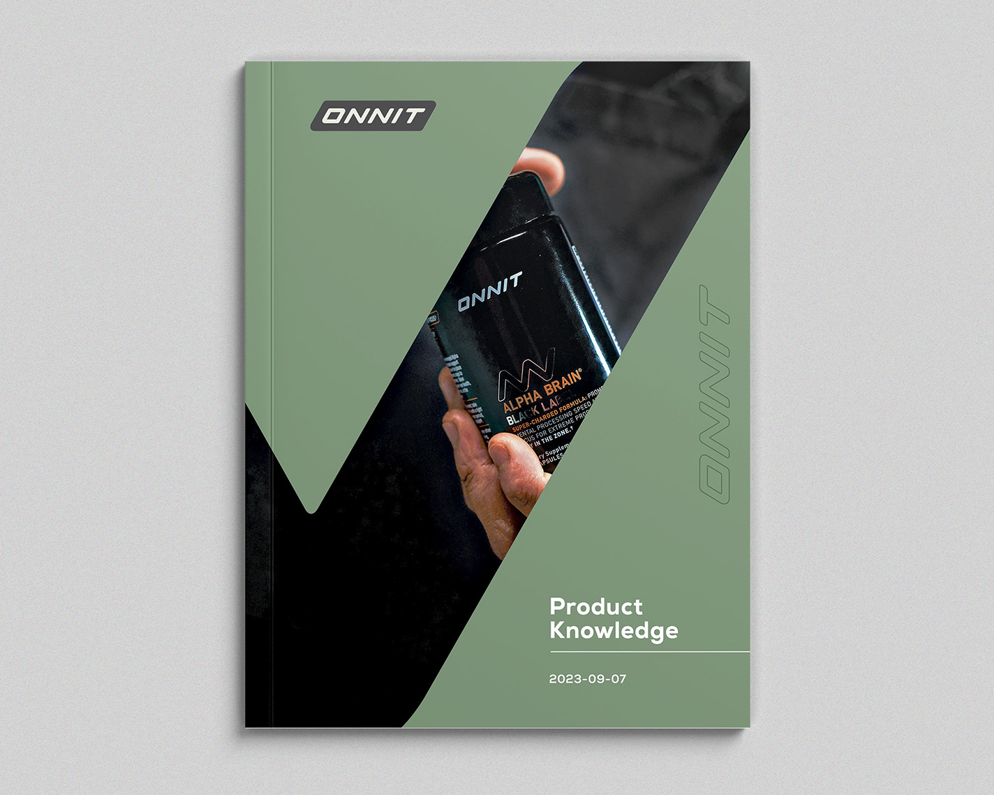
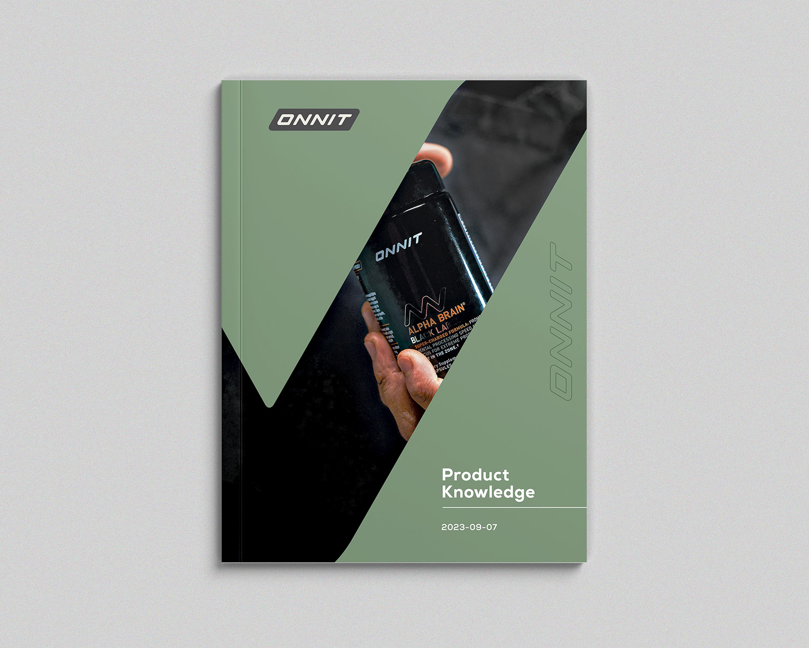
Every substrate, every 1/8" was considered. I move through each with Gesalt Design Principles, trying to push the envelope of brand identity without compromising the customer experience. These graphics are generally designed between 2 day to 2 weeks—with copywriting often changing along the way. Attention to details are so important on a print.
Every substrate, every 1/8" was considered. I move through each with Gesalt Design Principles, trying to push the envelope of brand identity without compromising the customer experience. These graphics are generally designed between 2 day to 2 weeks—with copywriting often changing along the way. Attention to details are so important on a print.